 |
| Our kitchen with the light on... |
Hello cutie pips,
There's so much loveliness I want to show you at the moment. So, so much. I feel rather excited by it all.
But first things first.
I'm thinking it's time for another Paint Colour Case Study.
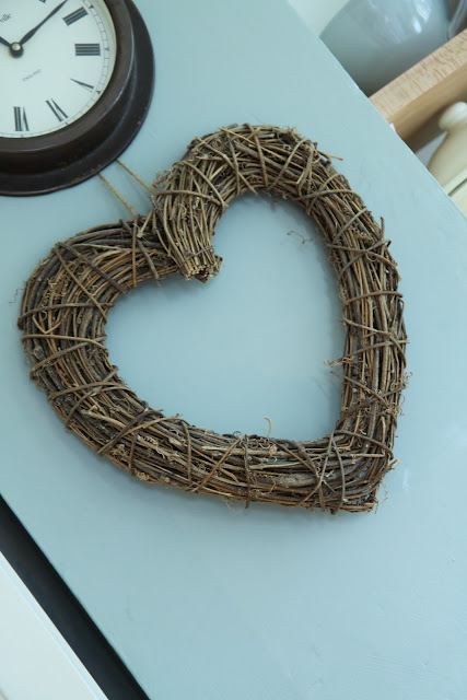 |
| ...and with the lights off |
So far, I've written features on Farrow and Ball Light Blue and Farrow and Ball Pigeon. Today, it's the turn of Farrow and Ball Blue Gray, which is the main colour that we chose for our kitchen makeover (yup, that's how they spell it: English company, American spelling? Not sure what's going on with that...).
 |
| Blue Gray in gentle daylight |
When I put together a case study for you, I source as many pictures as I can of the paint colour, from our house, here in the Cotswolds, and from the internet, in lots of different situations and lots of different lights so that you don't just have to rely on a teensy little square of colour on the tester card before you splash out on yet another sample pot.
When I put together a case study for you, I source as many pictures as I can of the paint colour, from our house, here in the Cotswolds, and from the internet, in lots of different situations and lots of different lights so that you don't just have to rely on a teensy little square of colour on the tester card before you splash out on yet another sample pot.
Basically, I hope these Farrow and Ball Case Study posts can do all the legwork for you so you can see at a glance whether the colour is going to work for you in *your* house with *your* lighting conditions.
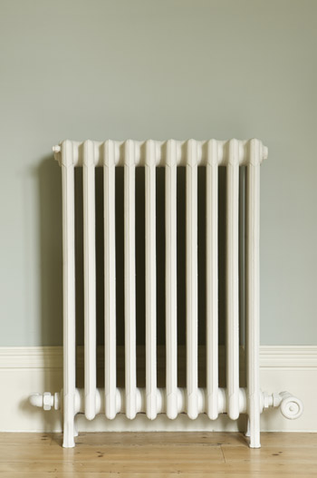 |
| Farrow and Ball's image of Blue Gray |
Basically, I hope these Farrow and Ball Case Study posts can do all the legwork for you so you can see at a glance whether the colour is going to work for you in *your* house with *your* lighting conditions.
 |
| Blue Gray outside in sunlight |
I've only selected pictures that I think are accurate reflections of what the colour really looks like, discarding those where the image has been tweaked beyond recognition or the flash has distorted the appearance of the colours.
And the second thing is that it's surprisingly green for a colour called Blue Gray.
Really surprisingly green.
It's the strongest colour we've chosen for our house so far and that's because it's in the room that gets least natural light. Anything cooler would have made the room look washed out and cold.
The more natural light you have in your room, the more of this gorgeous colour you can use.
So, the first thing that I need to tell you about Blue Grey is its intensity accumulates more than any other colour I've worked with. Particularly around internal corners and with a lack of natural light.Look at the shadowy internal corner of the picture below. See how much darker and more intense the colour is than on the chimney breast?
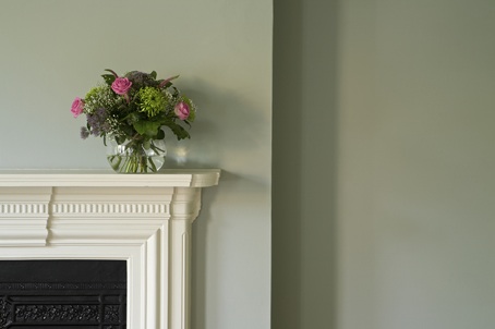 |
| Blue Gray in warm daylight |
And the second thing is that it's surprisingly green for a colour called Blue Gray.
 |
| Blue Gray on Woodwork |
Really surprisingly green.
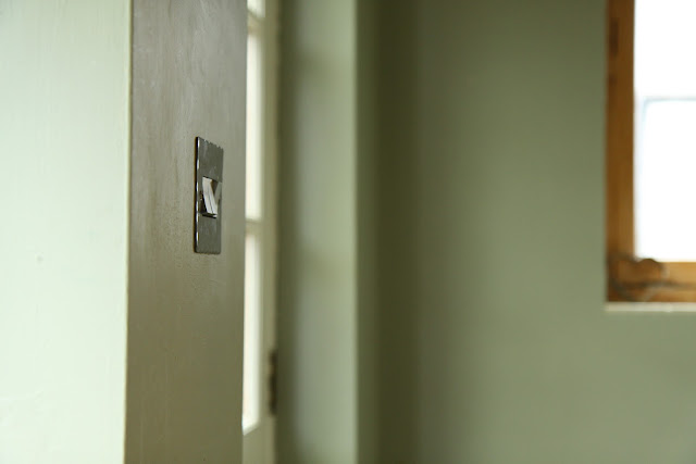 |
| Our kitchen in the sunshine....aah. |
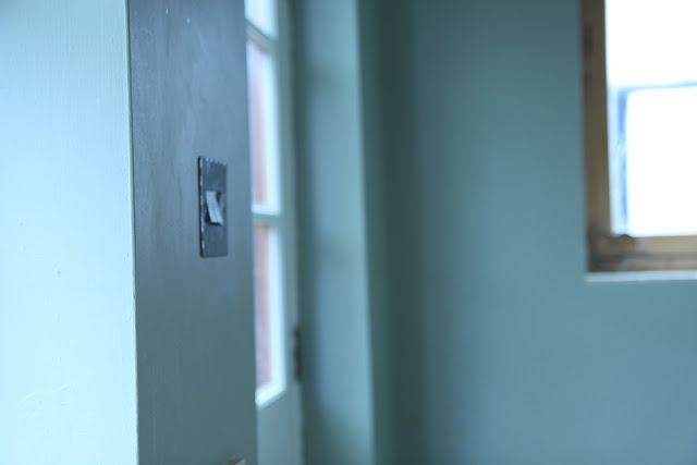 |
| ...and in the rain. |
It's the strongest colour we've chosen for our house so far and that's because it's in the room that gets least natural light. Anything cooler would have made the room look washed out and cold.
 |
| Blue gray with light streaming in through the large windows |
The more natural light you have in your room, the more of this gorgeous colour you can use.
 |
| Blue Gray in filtered daylight |
It's such a lovely colour. Warm and welcoming.
Here's a reminder of our 'before'.....
Here's a reminder of our 'before'.....

What's that you say?

And here's the after.....
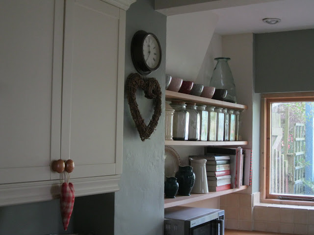 |
| Our kitchen on another overcast day |
What's that you say?
You've spotted that we've used another colour alongside the Farrow and Ball Blue Gray? You're so very right, you Eagle Eyes, you.
There's a story behind it, wouldn't you know.....but more on that another time.


