Popular Post
Recent Post
Showing posts with label farrow and ball. Show all posts

Case Study: Farrow and Ball Blue Gray


farrow and ball blue gray
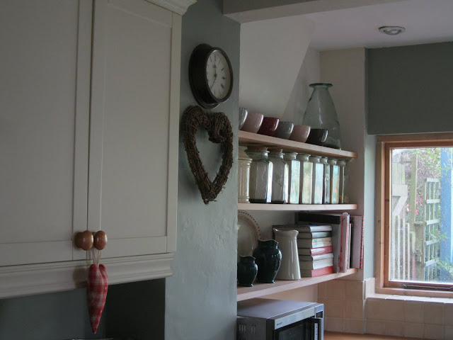
Our kitchen with the light on...
 
Hello cutie pips,

There's so much loveliness I want to show you at the moment. So, so much. I feel rather excited by it all. 

But first things first.

I'm thinking it's time for another Paint Colour Case Study.


farrow and ball blue gray our kitchen
...and with the lights off


So far, I've written features on Farrow and Ball Light Blue and Farrow and Ball Pigeon. Today, it's the turn of Farrow and Ball Blue Gray, which is the main colour that we chose for our kitchen makeover (yup, that's how they spell it: English company, American spelling? Not sure what's going on with that...).


farrow and ball blue gray in daylight
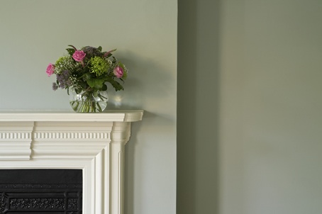
Blue Gray in gentle daylight


When I put together a case study for you, I source as many pictures as I can of the paint colour, from our house, here in the Cotswolds, and from the internet, in lots of different situations and lots of different lights so that you don't just have to rely on a teensy little square of colour on the tester card before you splash out on yet another sample pot.


farrow and ball blue gray image
Farrow and Ball's image of Blue Gray


Basically, I hope these Farrow and Ball Case Study posts can do all the legwork for you so you can see at a glance whether the colour is going to work for you in *your* house with *your* lighting conditions.

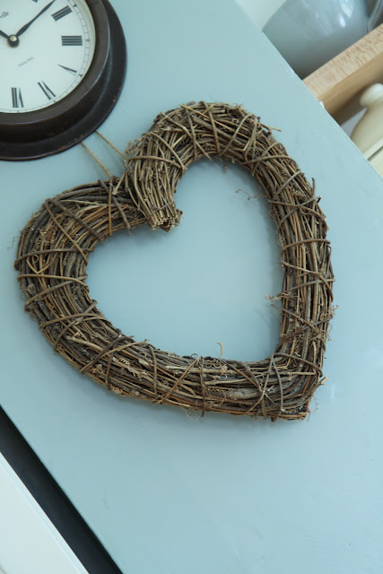
Blue Gray outside in sunlight


I've only selected pictures that I think are accurate reflections of what the colour really looks like, discarding those where the image has been tweaked beyond recognition or the flash has distorted the appearance of the colours.
 
Blue Gray in warm artificial light
 
So, the first thing that I need to tell you about Blue Grey is its intensity accumulates more than any other colour I've worked with. Particularly around internal corners and with a lack of natural light.Look at the shadowy internal corner of the picture below. See how much darker and more intense the colour is than on the chimney breast?


farrow and ball blue gray in warm daylight
Blue Gray in warm daylight


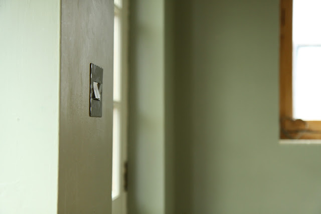
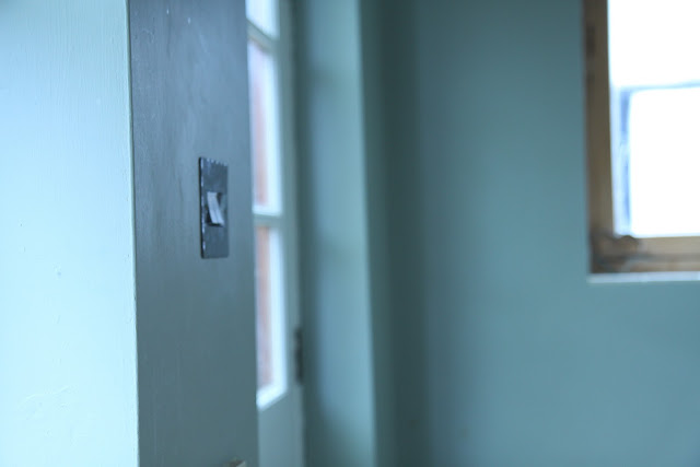
 And the second thing is that it's surprisingly green for a colour called Blue Gray. 


farrow and ball blue gray hutch
Blue Gray on Woodwork


Really surprisingly green. 


farrow and ball blue gray kitche in sunshine
Our kitchen in the sunshine....aah.


farrow and ball blue gray in shade
...and in the rain.


It's the strongest colour we've chosen for our house so far and that's because it's in the room that gets least natural light. Anything cooler would have made the room look washed out and cold.


farrow and ball blue gray natural light
Blue gray with light streaming in through the large windows


The more natural light you have in your room, the more of this gorgeous colour you can use.


farrow and ball blue gray daylight
Blue Gray in filtered daylight


 It's such a lovely colour. Warm and welcoming.

Here's a reminder of our 'before'.....


And here's the after.....


Modern Country Kitchen
Our kitchen on another overcast day
 

What's that you say?
You've spotted that we've used another colour alongside the Farrow and Ball Blue Gray? You're so very right, you Eagle Eyes, you.
There's a story behind it, wouldn't you know.....but more on that another time.
Now, anyone for another cuppa?


Images: Our kitchen, Our kitchen, unknown, Farrow and Ball, Gumtree, Cheverellwood, unknown, Our kitchen, Our kitchen, Country Living, Homes & Gardens, Country Homes and Interiors, Our kitchen, Our kitchen, Our kitchen.

Case Study: Farrow and Ball Pigeon


 The colour I chose for the bedside table was Farrow and Ball Pigeon. Choosing a colour for the bedside table transformation was a tricky bunny.

Like picking up a bar of slippery soap in the bath.


I scoured paint sample after paint sample to find the perfect shade. But as soon as I saw this one, held up against our bedroom colour (Farrow and Ball Light Blue) and our mahogany bed, I knew it was the one.


It called to me.


And the siren-like call of Farrow and Ball paints is pretty hard to resist.


I hope these Case Study paint posts will save you time when looking for paints, showing a variety of pictures that show Farrow and Ball Pigeon in different lights.

Although, I have to say it wasn't wholly unenjoyable....I rather like all that fussing and sighing over paint...


 The colour changes from very grey with a tinsiest hint of bluey-green to a grey-green in stronger sun.

Very much like a pigeon......?!...I'll get back to you on that one...


It's a beautiful colour that definitely leans towards the greener end of grey.....


....but has enough blue in it to give depth and interest.

Ignore it at your peril...


Images: House to Home, Providence, Farrow and Ball, Mob 24, Urban Grace, Amazon

Bedside Table Makeover


 Our bedside table was a toughie. It was one of those pieces of furniture that I had such an exact picture of what I wanted that it was never going to materialise without a bit of magic. Do you know what I mean?

It had to match what I already loved  in the room. Not matchy-matchy (I didn't want mahogany, for example; I thought that would look to 'heavy' and formal) but it had to be part of the attic-chic look.

It needed to be low. I had the bedside lamp all ready to go on it (Note to self: don't buy the bedside light before you have the table in place....). It's a tall mahogany candle-stick lamp. I love it but it has to fit under the slopey ceiling.....so the table needed to be LOOOOOOW.

Plus I actually like lower tables. I like to be able to see what's on them without having to lift my head from my pillow.

Lazy? Me? Errr....yes....

This was one of those pieces that had me looking....and looking.... and looking.....

Nothing.

Not. A. Thing.

Then inspiration struck (about time too, if you don't mind me saying...). I should buy one in the size I wanted and paint it! Problem-solved....

I started off with one similar to this:


I loved the design - ticks all the boxes - but obviously not the pine colour.

Pine and mahogany TOGETHER?

Big N.O..


So.....I decided to bite the bullet and get the paint brushes out!

 
This was my very first furniture makeover. I was really nervous. Far too nervous to think of picking up my camera, I realised after the deed was done!
 
 (sorry)
 
 
It needed stripping to get the waxed finish off - this was just a case of brushing the stripper on and then wiping off after ten minutes - sanding and priming (leave to dry...) and sanding and painting  (leave to dry...) and sanding and painting on the final coat.

Not rocket science but I think it's the thinking up of the idea that counts.... :-)

The sanding between coats is so important. It makes a huge difference to the quality of the end finish.

No little bumps.


What a palaver! But it gave me JUST what I was looking for. We used Farrow and Ball Pigeon, which I LOVE!

The quality of Farrow and Ball paint colours is incredible. Deep and intese yet chalky and subtle.
Mmmmmm....


I love the industrial feel to the new handles.

We took the old ones off and screwed these ones on in their place, after filling in the old holes, before we painted.


As well as screwing them in, I glued them down with Gorilla Glue to allow for pulling them open at awkward angles. I wanted a super-strong finish.

 Even King Kong couldn't get these babies off now.


I love the roomy drawers: perfect for all my magazines and books and hair clips and letters..... oh, and Mr Modern Country has part of one drawer.

He doesn't have many hair clips, you see...

It's got a good sized-top for putting lovely things on.


Here's the foolishly-pre-bought-but still-very-lovely-candlestick lamp.


All that faffing about with paintbrushes was worth it in the end.

*Sigh*


Do you know this book: Blogging For Bliss? It's FAB! I'm going to do a book review on Monday.

I think you'll LOVE it!


I want to say a BIG thank you to Brenda at Cozy Little Housee for giving me a lift on her very comfy Welcome Wagon.

This how she describes Modern Country Style:

Modern Country Style is Sarah's blog. She lives in the United Kingdom. Her blog is all about renovating her Edwardian home. Naturally, she loves Modern Country style! She has a keen interest in pared-back interiors,  infused with the warmth of country. Gentle grays, accents of red, and a hint of industrial.

Isn't that just spot-on? If I could make up how I'd like my style to be described that would be it!!

Thank you!


Did I say, I LOVE this colour?


The colour was the most important thing to get right. I am a crazy lady when it comes to paint choice.

I just can't rest until I've found the P.E.R.F.E.C.T colour.

The colour I chose might not be perfect for everyone - in fact, I rather hope it isn't - but it's COMPLETELY my cup of tea.


I wanted it to go perfectly with the wall colour. I spent aaaaages looking at paint samples.

Many happy hours....


It's one of those colours I can just staaaaaaaare at for ages.


  What do you think?


Paint Case Study coming right up......

Case study: Farrow and Ball Light Blue

Farrow Ball Light Blue

I've had so many enquiries about our Master Bedroom wall colour that I thought I'd give the answer it's very own post,  featuring our bedroom and also other rooms I've sourced to give you the very best idea of how the colour plays out on the walls.

I'm guessing this is in full sun because the front door looks so pale....

I always look at as many images as I can (isn't the Internet great?!) when choosing a potential paint colour to give me as little chance as possible of a nasty surprise. It's astonishing how much some colours change from the paint chart to the wall, or even from room to room.

Farrow Ball Light Blue
On an overcast day.....
Farrow Ball Light Blue
I love the contrast of the Light Blue with the beams against the white of the ceiling..

The colour I chose for the Master Bedroom is.............drum roll, if you please.......Farrow and Ball's Light Blue.  I feel a short pause for applause would be appropriate here.... 

The names of Farrow and Ball's paints sometimes need to be taken with a pinch of salt and this is certainly a case in point.Yes, it is Light and yes, it does have a hint of Blue but is has SO much grey in it, as well as a touch of green that calling the colour plain old  Light Blue just doesn't do it justice. 

I adore the use of colour in this  kitchen.

There are plenty of images out there but some seem to have distorted the colour somehow so I haven't included those.. The images I've found for you are the ones that I felt show the best representation of how Light Blue actually looks to the naked eye.

Ooooh, I said naked.
Farrow Ball Light Blue
Here you can see the effect of shadows on the wall....
A small tester square gives no hint of how beautiful this colour is. It builds up in intensity in the corners of a room, yet reflects the light beautifully when given a chance.

I love that chandelier in this bathroom
 Not many colours can be cool and restful yet warm and cosy at the same time but this one can. I think it's safe to say that it's my all time number one supremo favouritest color evah!

So.....do you like it?

Question for today: 

What is your  favourite paint colour? I think colour choice says so much about people so I'd love to hear.....
   
 Farrow Ball Light Blue